


ULTRA Digital Retro watch face
4.5136.00 Reviews
App Specs
- Version
- Varies with Device
- Updated On
- License
- $1.89
- Downloads
- 10,000+
- Developer
- Facer Studios
- Categories
- Personalization
- Platform
- Android
Screenshots
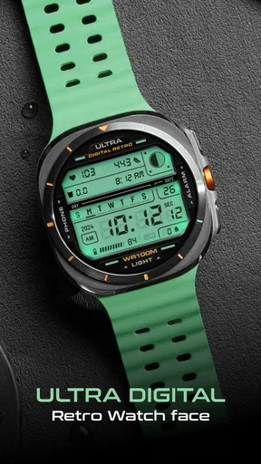
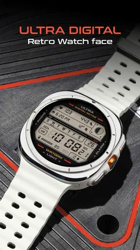
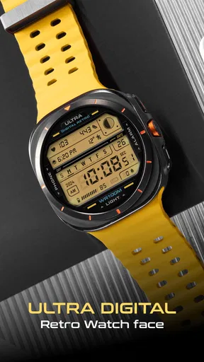
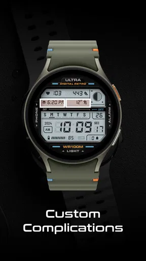
 Analysis by AppCompare
I like watch faces that know exactly what they are trying to be. ULTRA Digital Retro takes that approach with a compact digital design, adjustable colors, and a lighting effect that gives the display more personality than a plain numerical layout. It is a personalization app from Facer Studios, aimed at people who want their watch to look deliberately retro rather than simply functional.
My first impression is that this is a focused purchase, not a broad customization suite. You are choosing one particular visual idea: an old-school digital face with enough color control to make it fit your watch and your mood. That focus is its main appeal, but it also explains why it will not suit everyone. If you want a large library, fitness-heavy information, or a face that constantly changes its identity, this is probably too narrow. If you want a distinctive everyday face that remains easy to read, it makes much more sense.
How the retro design feels in everyday use
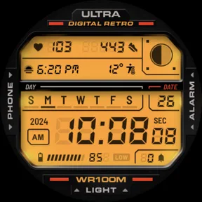
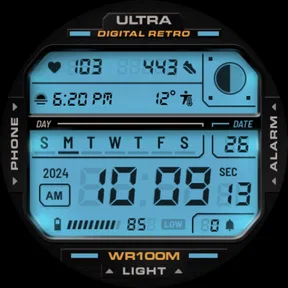
The strongest part of the experience is the visual character. The digital layout feels familiar without looking like a direct copy of a basic calculator-style display. The customizable colors let me move away from the default look and create something warmer, brighter, or more restrained depending on the watch and strap I am using. That matters because a retro face can quickly become costume-like if the colors are too loud. A muted combination works better for work, while a brighter setting gives the design more energy on weekends.
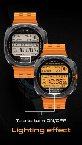
The lighting effect is the detail that separates this face from an ordinary digital watch display. It adds a sense of depth and glow, especially when the screen wakes briefly during a glance. I would not describe it as a dramatic animation experience; its value is subtler. It gives the numbers a more considered appearance and makes the face feel designed rather than merely arranged.
For quick time checks, the layout is naturally well suited. Digital numerals remove the need to interpret hands, and the retro styling keeps the information visually direct. I found that useful during short glances while walking, carrying groceries, or checking the time between tasks. The face does not ask me to explore a complicated screen before finding the basic information I need.
There is also a practical advantage to the limited visual concept. Because the face is built around a clear digital identity, it is easier to decide whether it belongs on your watch. Many personalization apps offer so many choices that browsing becomes the main activity. Here, the decision is simpler: either you like this particular retro treatment or you do not. That makes the app more appealing to someone who wants a finished style rather than another endless catalog to manage.
Color choices need a little restraint
The color customization is useful, but I would not treat every possible combination as equally practical. Strong contrast is the safest choice when you check the time outdoors or at an angle. Softer colors may look attractive in a preview yet become less comfortable for repeated glances. My advice is to begin with a clear, high-contrast setting, use it for a day, and only then experiment with more decorative combinations.
Worth Reading Before You Choose
Flipboard Shows What News Apps Must Do Beyond the Feed

Switching to Android Auto Means Rethinking Your Driving Routine
Google Calendar Makes a Crowded Week Easier to Manage
Ludo King Makes the Most of the Minutes Between Plans

Baby Panda World Brings Quick Play to Modern Phones, but Its Game Library Feels Busy
ESPN’s Live Game View Makes Following Close Games Easier
This is one of the less obvious trade-offs of the design: the lighting effect and color treatment are there to create atmosphere, but the face still has to work as a timekeeping tool. A visually impressive setup can become tiring if the digits lose priority. I prefer using the effect as an accent rather than trying to make the display as vivid as possible.
The app is listed at $1.89, which places it in the category of a small paid customization purchase rather than a major commitment. That price makes sense for someone who already knows they like the style. It is less compelling for a person who changes watch faces every few days and rarely settles on one design long enough to appreciate its details.
What to expect when opening and applying it
Because this is a watch-face app rather than a large productivity or media tool, my expectations for speed are straightforward. The important moments are opening the face, adjusting its appearance, and applying it to the watch. Nothing about the concept suggests a resource-heavy experience, and the focused design should make it feel more direct than a large customization platform filled with previews and unrelated content.
Still, the actual responsiveness of a watch-face installation can depend on the watch, its companion software, and the connection between the phone and wearable. I would not judge the face harshly if the transfer takes a moment, since that part is not the same as drawing the face on the watch once it has been installed. The useful distinction is this: the setup may involve a short handoff, while the finished face should be judged by how quickly it presents the time during ordinary glances.
For a normal day, I would expect the face to feel light because its purpose is narrow. It is not trying to maintain a complex feed or present a wall of live information. That simplicity is valuable for people who want their watch to remain predictable. I would choose it for a routine where the watch is mainly used for time checks and perhaps as a visual accessory, not as a dashboard for every part of the day.
Heavy-use moments reveal the real trade-off
The most demanding situation is not likely to be prolonged phone use inside the app. It is repeated waking of the watch throughout a busy day, especially when the lighting treatment draws attention to the display each time it appears. In that situation, the design has to balance style with the watch’s own screen behavior. The face itself is visually simple, which works in its favor, but any illuminated display still belongs to a wearable system with its own battery and wake settings.
That means I would pair this face with sensible display behavior rather than leaving every visual option at its most attention-grabbing setting. If you are already careful about battery use, the customization should be easy to fit into your routine. If you expect a watch face to deliver a strong effect continuously without affecting the overall experience of the watch, your expectations may be less realistic.
Another heavy-use case is changing colors repeatedly while searching for the perfect combination. This is where the app can become less efficient emotionally, even if the software remains simple: the more time I spend tweaking, the less I am using the face as a finished tool. I recommend choosing two or three candidates, wearing each briefly, and keeping the one that remains readable in the situations where you actually check the time. That workflow is faster than endlessly optimizing a preview.
The face also makes sense for a secondary watch or a relaxed weekend setup. On a formal watch, I might prefer a quieter analog design, while on a casual wearable the retro digits and lighting effect feel more natural. This is not a weakness in itself; it is a reminder that personalization works best when the design matches the setting instead of trying to be universal.
Stability and recovering from interruptions
Reliability matters more to me in a watch face than a flashy first launch. Once I have selected a design, I want it to remain available when I raise my wrist, return from another screen, or reconnect with the phone after a period away. ULTRA Digital Retro’s narrow purpose gives it a good foundation for that kind of dependable use: there are fewer moving parts in the face than in a design built around constantly changing content.
The moments I would pay attention to are the practical ones. After installing it, I would confirm that the chosen colors remain the way I set them. I would also check the face after restarting the watch or moving between the watch and its companion app. These are not glamorous tests, but they are the quickest way to discover whether a face fits daily use rather than only looking good during setup.
If the watch temporarily shows another face during a connection or restart, I would treat that as a recovery question rather than an automatic failure of this design. Wearables sometimes need a moment to restore their selected face after an interruption. The important thing is whether the chosen appearance returns without requiring a complete redesign each time. A focused face like this should be easy to reselect if needed, but I would still keep the initial setup simple and avoid making a dozen tiny adjustments before confirming that the basic installation is working.
The app has an average rating of 4.5 from around 680 ratings, with roughly 136 written reviews. That suggests a generally positive response from the people who chose to evaluate it, and I can understand why: the concept is clear, the visual result is easy to recognize, and the price is modest. I would read that reception as encouragement for fans of the style, not as a promise that every watch or personal taste will produce the same experience.
Device limits and who should think twice
The age rating is Everyone, so the design is presented as suitable for a broad audience. The more important question is not age but device fit. A watch face is only useful when it works comfortably with the wearable and display you already own. Screen size, shape, brightness, and the way the watch handles installed faces can all affect how the retro digits and lighting effect feel.
On a smaller screen, the simplicity should help because the face is not competing with a large number of tiny complications. On a brighter or larger display, the color adjustments may give you more room to create a distinctive look. Either way, I would judge the face from normal wrist distance rather than from a close phone preview. A setting that looks refined when enlarged may feel too dim or too busy once it is reduced to a quick glance.
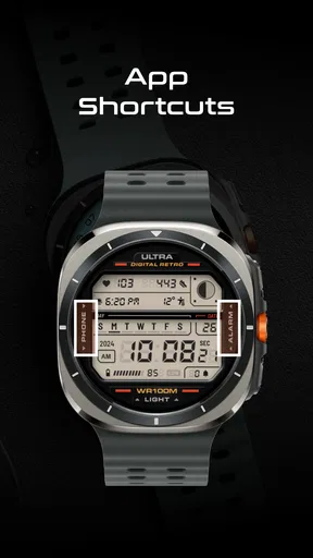
I would also skip this app if your main reason for choosing a watch face is detailed health information, weather, calendar planning, or a dense set of shortcuts. The appeal here is the visual treatment and direct time display, not turning the watch into a miniature control panel. A more information-rich alternative would be better for someone who needs to read several live details without opening another screen.
It is also not the ideal choice for people who want a traditional analog appearance. The retro digital identity is not a minor theme layered over a flexible template; it is the point of the face. If you normally prefer elegant hands, restrained typography, or a face that blends into formal clothing, another personalization option will probably feel more natural.
On the other hand, I think it is a good fit for anyone who wants a recognizable look without spending time building a design from separate elements. It suits a casual outfit, a vintage-inspired accessory, or simply a user who is tired of generic digital faces but still wants the clarity of numbers. The fact that it comes from Facer Studios also places it within a developer known for watch-face personalization, while this particular release keeps its idea unusually focused.
A practical setup routine I would use
My preferred setup would be deliberately short. I would install the face, apply it before making detailed changes, and confirm that the basic digits are comfortable to read. Then I would adjust the colors for the lighting conditions where I spend most of my time. If I work indoors, I might choose a calmer combination; if I often check the watch outside, I would prioritize contrast over subtlety.
After that, I would wear it through a normal morning rather than judging it immediately. Morning light, indoor lighting, movement, and quick glances reveal more than a static preview. I would pay attention to whether the lighting effect helps me recognize the display or distracts me from the numbers. This is a useful test because the face’s main feature is visual: its success depends on how the effect behaves during real, brief interactions.
I would then make one final adjustment and stop. That last step is important because watch-face customization can become a search for perfection that never improves usability. The best result is not necessarily the most colorful one. It is the combination that lets me read the time instantly while still giving the watch the retro personality I wanted.
For someone buying it as a gift, I would only recommend it when the recipient already likes digital retro styling. The price is low enough to feel approachable, but the design is specific enough that personal taste matters more than technical ambition. A person who enjoys changing faces frequently may appreciate it as one option in rotation, while a person seeking a single all-purpose face may find its visual identity too specialized.
My performance verdict
ULTRA Digital Retro feels best when I treat it as a lightweight visual choice rather than a feature-packed watch platform. Its speed expectations are modest and sensible: setup should be a direct process, and the finished face has a simple job. Its heavy-use behavior is tied more to the watch’s screen and wake habits than to a complicated interface. Its reliability appeal comes from staying focused on the time instead of constantly demanding attention.
The main limitation is equally clear. This is not a universal dashboard, and the lighting effect will not appeal to someone who wants the quietest possible display. Color customization gives useful control, but it also asks me to make good choices for contrast and comfort. Those are manageable compromises, especially at $1.89, as long as I buy it for the retro look rather than expecting a complete collection of smartwatch tools.
With over 10 thousand installs, it has found an audience that is still relatively focused compared with huge personalization platforms. I see that as consistent with the app’s character: it is a specific face for people who want this particular mood. The release date of Aug 20, 2024 also places it as a relatively recent addition to the category, but I would base the decision on the design itself rather than on how new it is.
My recommendation is simple: choose it if you want clear digital timekeeping with a colorful retro finish and a lighting detail that makes the display feel less ordinary. Skip it if you need extensive live information, an analog style, or a face designed to disappear into every outfit. For the right user, ULTRA Digital Retro is appealing precisely because it does not try to be everything. It gives the watch a strong identity, stays easy to understand, and rewards a little restraint during customization.
Pros
- Classic digital design is easy to read at a quick glance.
- Offers a nostalgic retro style for Wear OS users.
- Compact layout keeps the time visible without visual clutter.
- Works well with casual
- sporty
- and everyday watch styles.
- Useful for users who prefer a simple digital display.
Cons
- Limited appeal if you prefer modern analog or highly detailed faces.
- Some customization options may feel basic compared with premium faces.
- Small complications can be difficult to read on compact watch screens.
- Battery impact may vary depending on ambient display settings.
- Compatibility is limited to supported Wear OS smartwatches.
FAQs for ULTRA Digital Retro watch face
What is ULTRA Digital Retro watch face?
ULTRA Digital Retro is a customizable digital watch face designed for compatible Wear OS smartwatches. It combines a nostalgic retro-inspired display with modern information panels, allowing you to view the time, date, battery status, and other useful details directly from your wrist. Its overall appearance is focused on bold digital styling and quick readability rather than a traditional analog design.
Which smartwatches are compatible with ULTRA Digital Retro?
Compatibility depends on the version of Wear OS installed on your smartwatch and the requirements listed on the app’s Google Play page. It is generally intended for Wear OS devices, but not every older watch or non-Wear OS model will support it. Before downloading, check the supported device information and make sure the watch is paired with an Android phone capable of installing Wear OS watch faces.
Can I customize the ULTRA Digital Retro watch face?
The watch face offers customization options that may include color styles, display layouts, complications, and the information shown on the screen. Available controls can vary according to the watch model and the edition installed. After installation, customization is normally accessed through the Wear OS companion interface or by pressing and holding the active watch face, making it possible to adjust the look without replacing the design.
Does ULTRA Digital Retro watch face affect battery life?
Like any active smartwatch watch face, ULTRA Digital Retro uses a small amount of battery power, although the actual impact depends on your display settings, screen technology, brightness, complications, and how often the watch is used. A simple configuration with fewer live data fields usually consumes less energy. If battery life is important, avoid unnecessary complications and use the watch’s standard power-saving settings.
Is ULTRA Digital Retro watch face free to download?
The availability and pricing of ULTRA Digital Retro can depend on the current store listing, region, promotions, and whether optional premium features are offered. Review the Google Play information carefully before installing, including in-app purchase details and permissions. The watch face may also require a compatible Wear OS device, so downloading it on an unsupported phone or smartwatch will not guarantee successful installation.


